Get in Touch
Looking for a top-notch designer? Let me help bring your vision to life! I specialize in user experience & user interface design, graphic design, and branding.
I’m currently seeking a full-time, remote role in UX/UI Design. Let’s see if we’re a match made in heaven!
My Resume

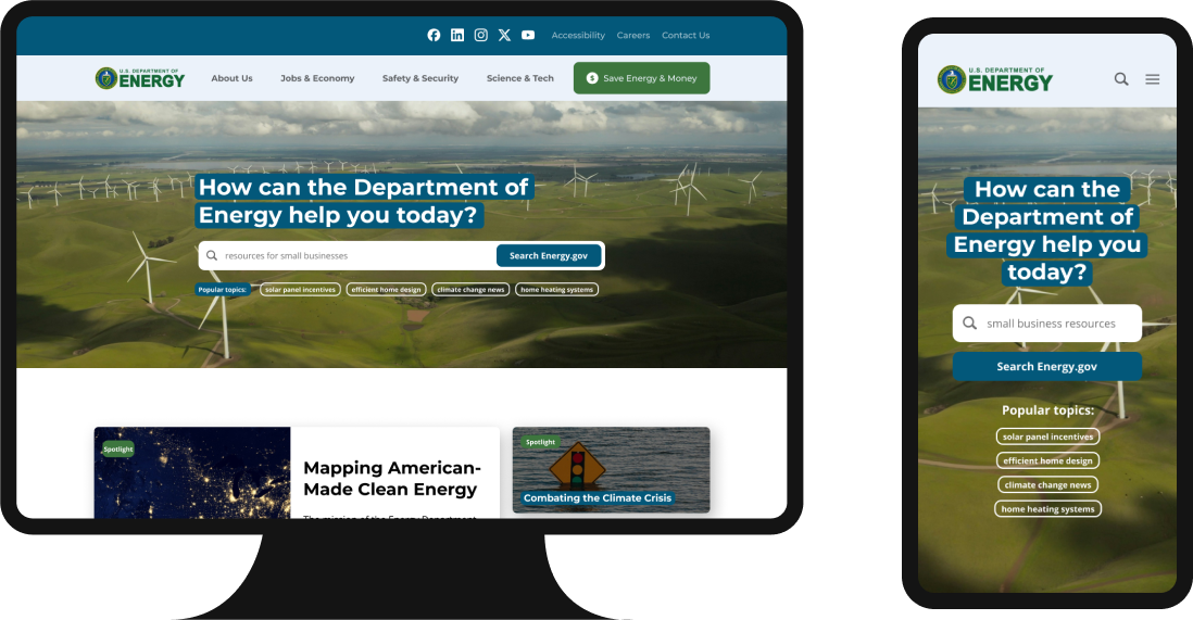
Energy.gov Redesign

Overview
The US Department of Energy addresses America’s energy, environmental and nuclear challenges and aims to help the country and its citizens gain safety and prosperity. Their website includes news and press about the department’s accomplishments as well as guides, incentives, and other resources about energy efficiency.
However, the current site is complex, with users finding it overwhelming and struggling to find relevant resources. I redesigned the site with a focus on helping users easily find the information they need.
Project Details
Role
UX/UI Designer
Timeline
Jan - Feb 2024
Team
Dani Macuk
Faria Rahman
Nikita Wagenman
Tools Used
Figma, Canva, Google Docs, Zoom, Slack
The Solution
After a thorough discovery and analysis, I found that solutions needed to focus on helping users quickly find answers to and resources for their queries. My redesign takes the multitude of resources and tools available on Energy.gov and organizes them in an intuitive, straightforward system, while giving users the ability to pinpoint their searches and find the right info.
Design Process
Discover

Analyze

Ideate

Design

Test
—————
Discover
This project began as a bootcamp assignment to redo one of the US government department websites with user accessibility and experience in mind. My teammates and explored the site, immediately noticing how complex it was. We all found that it was difficult to find information that matched our queries and level of understanding.
Research
To learn more about what could be improved, we evaluated the site’s heuristics and conducted 6 user tests.
User tests included prompts asking them to find specific info about government tax incentives and resources for energy efficiency projects.
identified that a typical user of the site might access it with the goal of finding info about electricity costs and efficiency projects/incentives.
With this in mind, we interviewed users who were home owners or renters looking for cost-efficient ways to reduce their energy bills.
Interview Highlights
Discovery Highlights

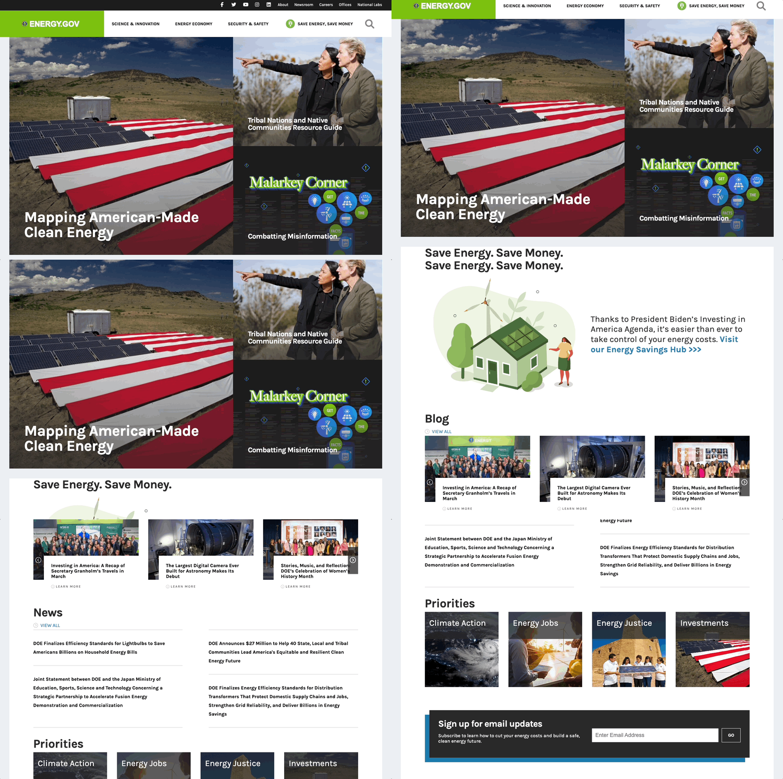
The homepage is dominated by information the department deems important, rather than info the user needs to complete their task.
Users overwhelmingly found the homepage useless when coming to Energy.gov to find resources for energy efficiency projects or info about available rebates.
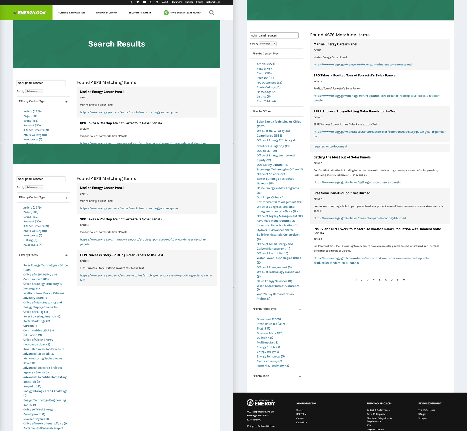
The search functionality gives users no way to define or filter possible results before submitting a query.
Search filters only appear after submitting a query, and too many (unclear) options for filtering and sorting are presented.
Users were immediately overwhelmed and confused by options to filter search results. Nearly all users tested found the search functionality useless, and could not find relevant information.
Most decide to click through the main menu to find information rather than using the search button.
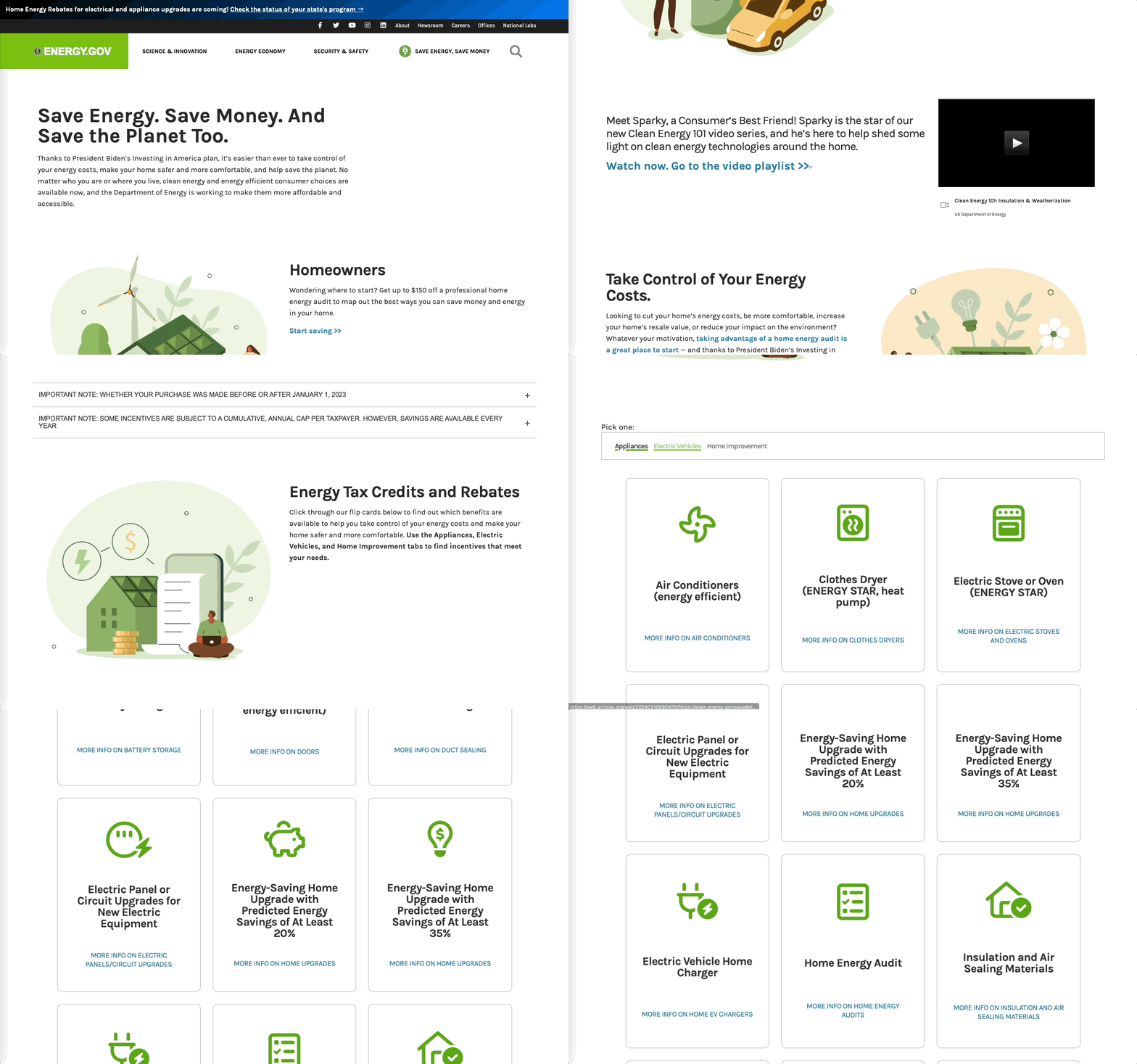
The Energy Savings Hub was useful as a “main base” to find more detailed information, but helpful UI elements could sometimes get buried.
While it sometimes took too many clicks (or reversing back to a previous page) before finding the right information to answer their questions, users greatly preferred using this page as starting point.
Users often missed UI elements such as the tabs to switch between “Appliances,” “Electric Vehicles,” and “Home Improvement” cards, preventing them from finding useful information.
Analyze
After we conducted user tests, I set off to analyze, ideate, design, and test on my own. It was quickly clear to me that improvements to the site needed to be made to help users find the right information. Three key issues jumped out:
Problem #1
Problem #2
Problem #3
User Persona
I developed a persona to represent the average Energy.gov user and to guide me as I began to ideate solutions to user problems.
Daniel is a married homeowner with a comfortable salary who dreams of turning his house into a sustainable, cost-efficient home. He doesn’t always know where to start, so he seeks organized resources to guide him as he plans out the details of these projects.

Daniel, 43
Risk-AverseOrganizedIntrovertedHandy
Needs & Goals
- Save on energy costs
- Find available rebates & incentives for upgrades
- Figure out how to start a home energy efficiency project
Pain Points
- Has never taken on such a big home project before
- Not 100% sure what info will be most helpful to him
I knew that I had to keep the Department of Energy’s likely constraints in mind, too. I prioritized ideas that packed a punch for the user while also understanding the needs of the Department—namely, a space to spotlight the important work they do, and minimizing the need to substantially change how content is organized on the back-end within their CMS.
—————
Ideate
It was clear that I needed to find solutions that targeted users’ ability to quickly and accurately find information on the site. With this in mind, I focused on brainstorming ideas that targeted search functionalities, navigation menu redesigns, and page layout clarity.
Problem #1
It takes too long for users to find helpful, relevant information
Possible Solutions
Problem #2
The homepage doesn’t help users navigate the site
Possible Solutions
Problem #3
Inconsistencies in layout and menus cause confusion
Possible Solutions
—————
Design
Revamped, Highly Intuitive Site Architecture
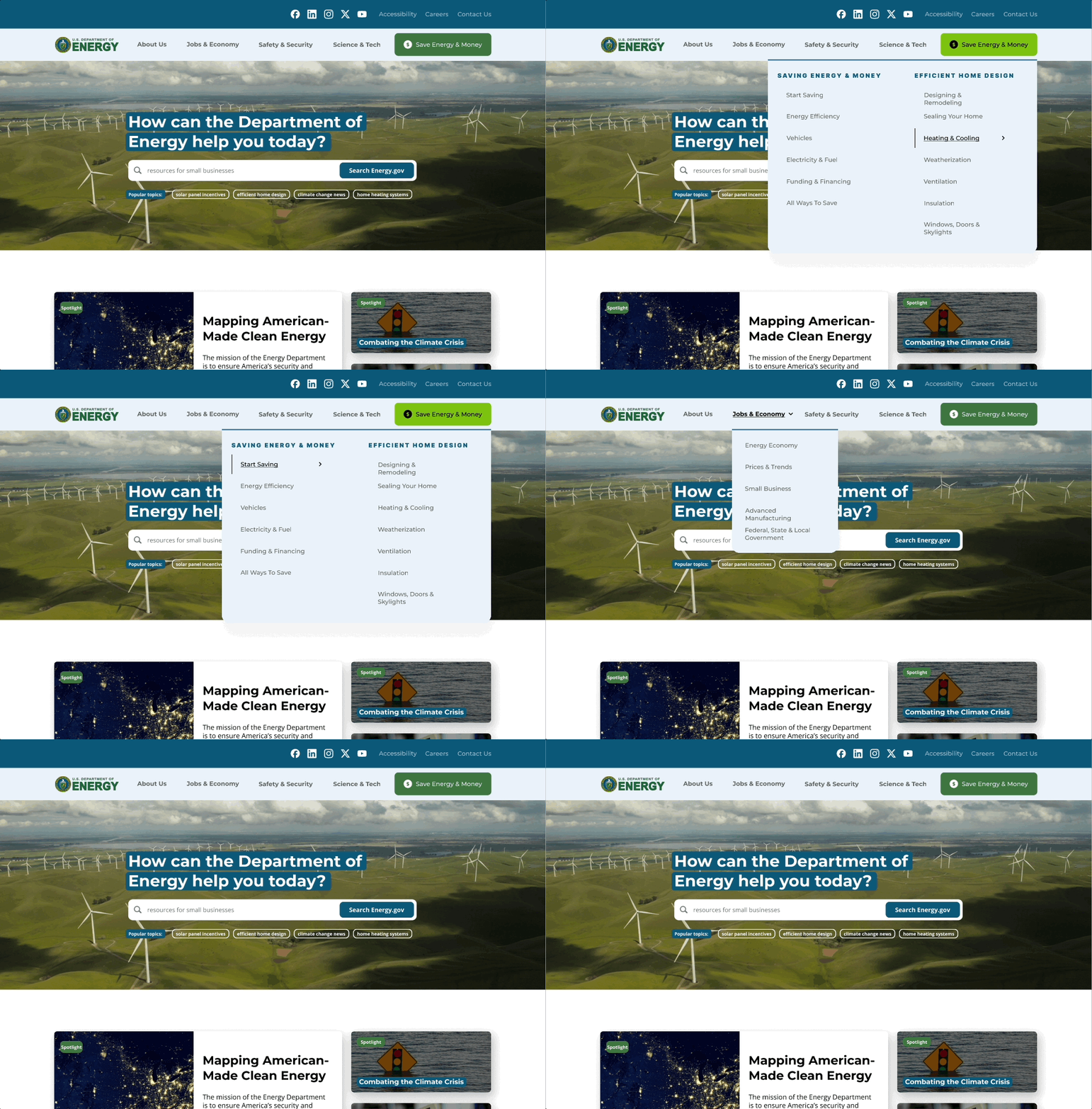
During testing, users gravitated towards the “Save Energy & Money” button, using it as a home base as they tried to find a page that helped them answer a question or find a resource.
I wanted to retain this functionality, while making it easier for users to quickly find a relevant category relating to their search query.
The new site navigation adds additional top-level pages that previously were only accessible after clicking into the “Save Energy & Money” page, reducing the number of clicks users take to reach their target page.
Putting Search front and center on the homepage
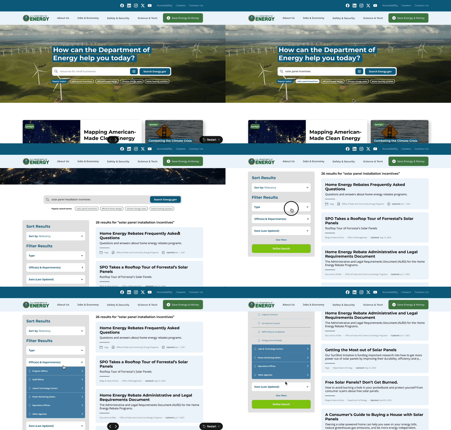
Users may come to the Energy.gov site with a specific query in mind, ulike what tax incentives are available in Texas for residential solar panel installation.
The homepage spotlights the site’s search functionality, and lists the most popular search terms front and center.
New search filters allow the user to find content based on a variety of page categories, as well as media type, date updated, or sub-department.
Creating a Design System & consistent elements
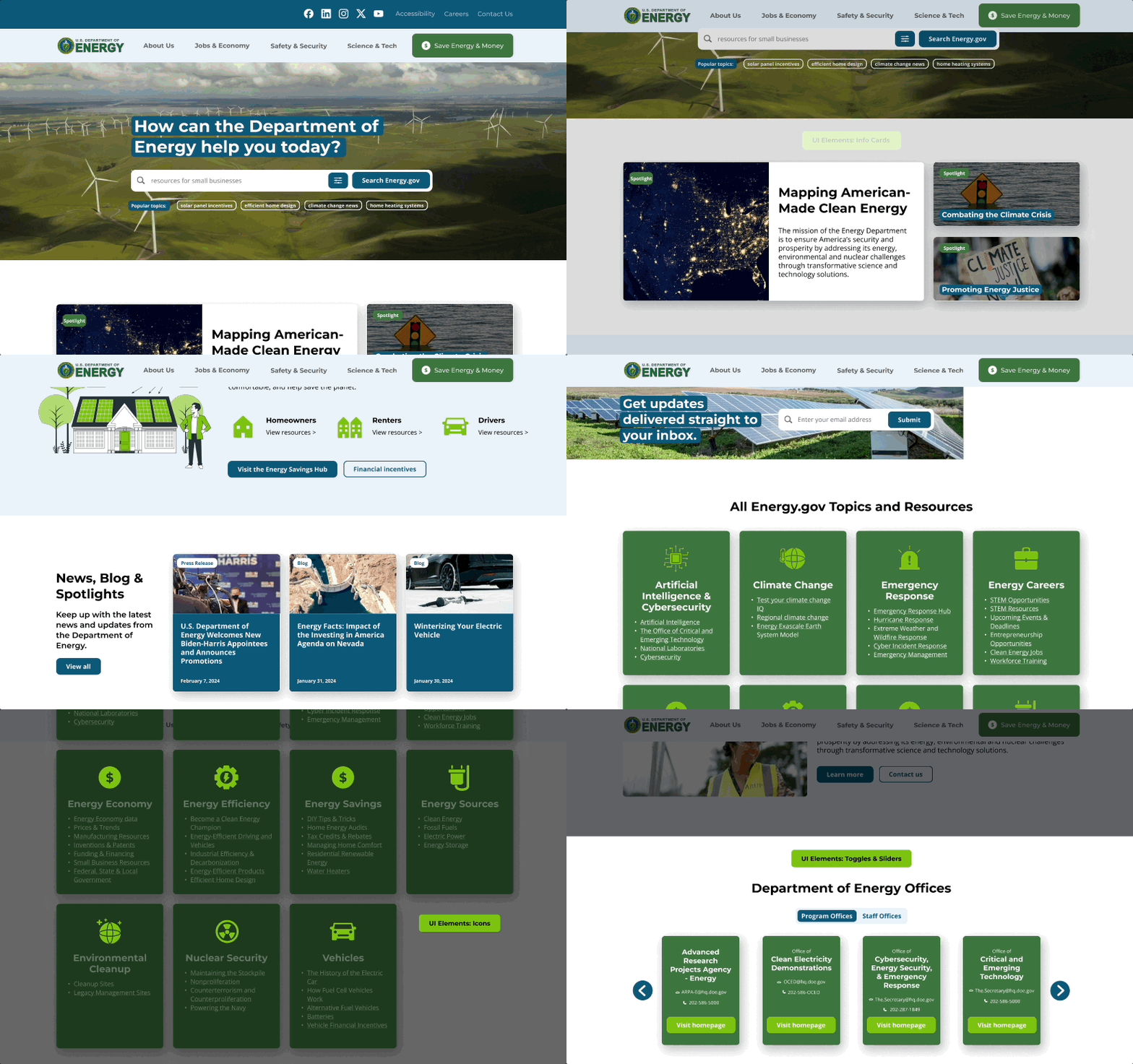
One-off or inconsistent UI elements or page layouts cause confusion. Users often missed relevant info during our tests because of poorly designed elements.
With the Department of Energy’s existing branding and page content in mind, I created a style guide and comprehensive library of UI elements to use throughout the site.
The new page designs help users find information with fewer clicks while giving much-needed consistency to the site in its entirety.
Final Thoughts
This project was a big undertaking! I learned a lot, especially regarding the importance of user testing. With more time and resources, I would conduct A/B tests at various stages of the design process, using these rounds of feedback to make tweaks to page layouts and individual UI elements like the advanced search functionality.
Overall, I am extremely proud of the solution I came up with, and believe that it could meet constraints of this government agency while vastly improving user experience, especially for renters and homeowners.
What I'd do next: What I’d do next: I would love the opportunity to research and develop the site with two to three additional audiences in mind. Energy.gov serves many purposes, with users ranging from renters & home owners to small business owners and news reporters. With these groups in mind, the site redesign could be refined and more pages prototyped to help all these users achieve their goals.
Resources
Social Media Icons from Pictogrammers
Design Process Icons from Unsplash and the Department of Energy website and Instagram
Fonts from Google Fonts
Illustrations from Storyset and @lierstudios (via Canva)
Images from Unsplash and the Department of Energy website and Instagram